Live Chat vs. Contact Forms for Law Firms

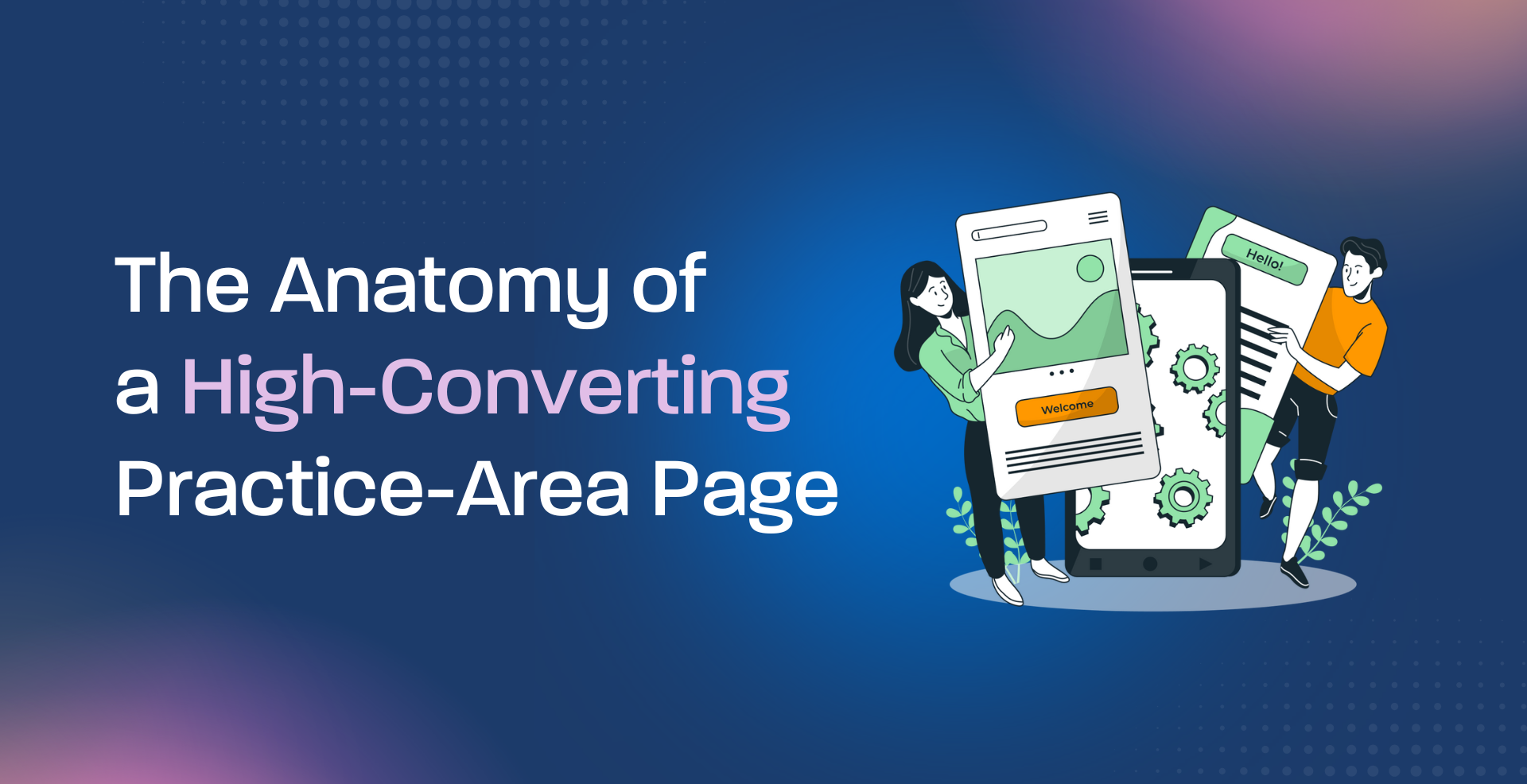
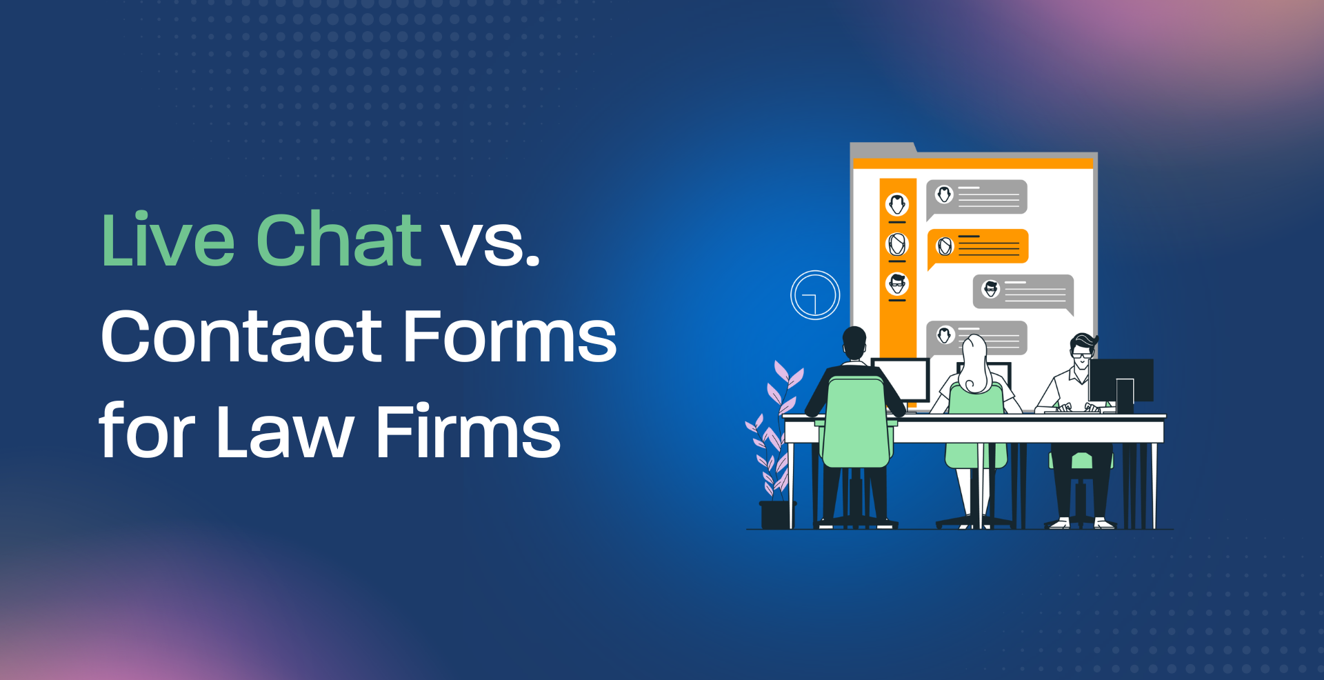
Why Choosing the Right Intake UX Could Be Worth Six Figures

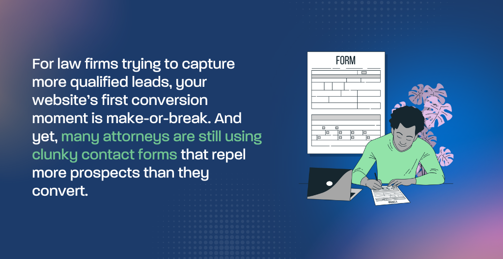
For law firms trying to capture more qualified leads, your website’s first conversion moment is make-or-break. And yet, many attorneys are still using clunky contact forms that repel more prospects than they convert.

Today’s prospects—especially personal injury, family law, and immigration clients—want answers fast. And that’s where live chat shines.

In this guide, we’ll unpack:

  • How live chat and contact forms perform in real legal lead conversion.
  • Which user experience (UX) builds more trust and fewer drop-offs?
  • When each tool makes sense, and how to ethically use both under the bar rules.

If your law firm marketing already follows the strategy laid out in our Law-Firm Growth Blueprint, this is your deep dive into website intake UX, where split-second design decisions either convert six-figure cases or send them to your competitors.

chat vs contact

Do Live Chats Convert More Leads Than Forms?

Short answer? In most cases, yes. Live chat typically boosts law firm lead conversion by 30–50% compared to static contact forms.

But it’s not just about volume. The real power lies in:

  • Capturing prospects in the moment of need
  • Providing immediate, human-like responses
  • Pre-qualifying leads before they hit your intake team

When Contact Forms Still Win

That said, contact forms still have a place—especially for more complex legal matters where clients may want to compose their message carefully.

Here’s when forms outperform chat:

  • When targeting B2B or corporate clients (e.g., M&A, business litigation)
  • After-hours inquiries where chat is unavailable or poorly staffed
  • When using intake form conversion best practices, like:
    • Fewer fields
    • Visible trust signals near submit button
    • Mobile-first layout

UX Tips: How to Ethically Optimize Both

Regardless of your tool, the experience must build trust, especially under ABA rules.

For Chat:

  • Use human-trained intake staff or advanced chatbots with disclaimers
  • Always include: “This is not legal advice” + link to privacy policy
  • Offer immediate next steps: “Schedule a consult” or “We’ll call you within 1 business day.”

For Forms:

  • Add microcopy like: “We’ll respond within 1 business day.”
  • Include a client review right next to the form
  • Use law firm website contact form best practices
chat vs contact

So Which Is Better?

It depends on your practice area, case type, and client psychology.

Hybrid setups win—embed chat on high-intent pages (like “free consult” or PI services) and keep smart forms for in-depth queries.

Want help choosing the right tool for your firm?
Book your Free 15-Minute Growth Audit, and we’ll review your entire intake UX—no pressure, no upsell.

Want a Professional Eye on Your Intake UX?

If your gut says your firm is ready to grow, but your intake process feels clunky, let’s fix it. At Geeks for Growth, we specialize in building ethical, conversion-optimized legal websites that attract the right clients.

Book a Free 15-Minute Growth Blueprint Audit
We’ll analyze your intake flow and show you what’s costing you qualified leads. Schedule Your Free Consult →
(Only 3 free slots per practice area per month.)

The Anatomy of a High-Converting Practice-Area Page

Turn Traffic into High-Value Legal Leads—One Page at a Time

Most law firm websites treat their practice area pages like digital brochures. But when done right, these pages can become your most powerful conversion engine—guiding serious clients to book consults, trust your expertise, and sign retainer agreements.

At Geeks for Growth, we’ve studied various legal service pages across Salt Lake City and beyond. The difference between “just another page” and a high-converting practice-area powerhouse? Structure, messaging, and trust-building design.

In this guide, we break down:

  • How to speak directly to your ideal client’s pain points—without sounding generic.
  • How to structure your page for both SEO and UX.
  • The must-have conversion elements (above and below the fold).

If you’re following our full Law-Firm Growth Blueprint, this article zooms in on the “Web Design That Converts” pillar, where great content meets intentional layout to drive results.

What Makes a Great Legal Practice-Area Page?

Your practice area page should do five things quickly and clearly:

  • Say who you help: “We represent seriously injured clients in Utah trucking accidents.”
  • Show you’ve done it before: Add a brief, anonymized success story or testimonial.
  • Build trust: Include badges (Super Lawyers, AV-Rated), secure form notices, or case results.
  • Guide action: Clear CTA: “Book a Free Injury Case Review” or “Call Now to Schedule.”
  • Reassure: “We don’t charge unless we win,” or “You’ll speak directly with an attorney.”

 Keyword Tip: Use terms like “best truck accident attorney in Utah” naturally within headers, image alt tags, and testimonial captions.

Practice-area page

SEO for Legal Practice Pages: Getting Found by the Right Clients

SEO for legal practice pages means more than keyword stuffing. Google rewards structured, helpful content with clear headers, fast load times, and local SEO signals.

Quick checklist:

  • Title tag and H1 match your ideal case type (e.g., “Salt Lake City Divorce Lawyer”).
  • Include legal-service schema markup for enhanced search visibility.
  • Use internal links to related cluster pages and blogs (like child custody or prenup topics).
  • Add client-generated content: FAQs, reviews, or video clips to boost engagement.

High-Converting Legal Landing Page Essentials

The best pages mirror what premium clients are already searching for, then remove their objections.

Above the fold (first 600px):

  • Clear headline: “Injured in a Commercial Truck Accident?”
  • Subtext: “We’ve recovered millions for clients like you. Get a free case review today.”
  • One-click CTA button: “Get Help Now”

Below the fold:

  • Overview of legal approach.
  • Proof of past success (verdicts, settlements).
  • Attorney bio excerpt or photo.
  • Testimonials with disclaimers.

Writing Website Content for Law Firms That Builds Trust

Forget robotic legalese. High-converting content sounds clear, confident, and client-focused. Talk benefits, not just services:

Instead of:

“We handle personal injury claims.”

Try:

“We help injured Utah families recover medical costs, lost wages, and peace of mind.”

Anchor your content with phrases like:

  • “Results-driven representation”
  • “Compassionate counsel backed by courtroom wins”

“Schedule your free case review today.”

Best Practices for Lawyer Web Pages in 2025

Don’t forget these 2025 must-haves:

  • Mobile-first design with quick-load speed.
  • ADA-compliant layout and readable fonts.
  • Trust-enhancing security signals (SSL, HIPAA-compliant forms).
  • Embedded local map and directions.
  • FAQ accordion for easy browsing.

These elements don’t just help users—they improve your ranking and reduce bounce rate.

This article is part of our larger strategy detailed in the Law-Firm Growth Blueprint. For a deeper dive into branding, web design, and SEO that attracts better cases, read the full guide.

Practice-area page

Want a Professional Eye on Your Practice Pages?

If you’re unsure whether your service pages are doing the heavy lifting, let’s fix that. At Geeks for Growth, we specialize in law firm landing pages that attract and convert premium clients—without fluff, gimmicks, or compliance risk.

 Book a Free 15-Minute Growth Blueprint Audit.
We’ll review your top practice-area page and give you 2–3 high-impact fixes.

 Schedule Your Free Consult
(Only 3 free slots per practice area per month to avoid market conflicts.)